Find Answers and Get Support › Forums › Cera – Intranet & Community Theme › Website Setup › Menus › Responsive Issues with Theme and Elementor
- This topic has 5 replies, 3 voices, and was last updated 5 years, 8 months ago by
 Themosaurusrex.
-
AuthorPosts
-
 SurrealerParticipant@surrealer
- 16 Topics
- 47 Posts
I have some responiveness issues with my page design and Elementor.
It’s because of the switch of vertical navigation menu.
Is it possible to add an option that if the browser window is resized to XXXX the the menu automatically switches to the closed mode?
This would help me a lot and I bet I’m not the only one who runs into some issues here.
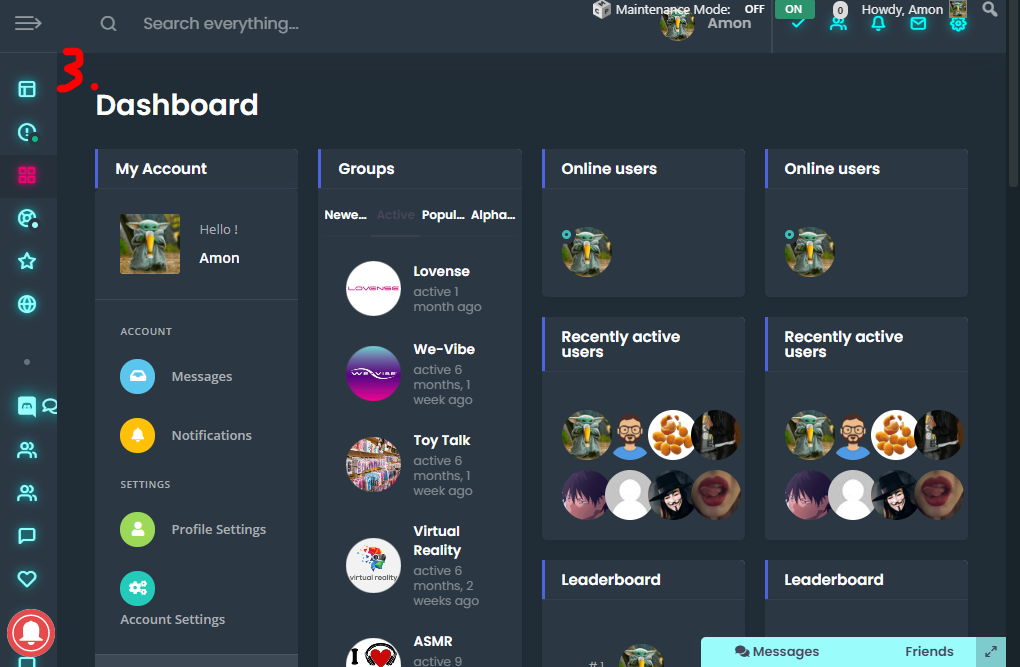
Here is an example:
Screenshot 1:
3 columns have a way too much space as seen.
So I thought, jeah switch it to 4 columns..Screenshot 2:
But with 4 columns it looks bad when the window is resized to small.Screenshot 3:
Automatic swith to closed menu (or the option to do so) would fix this issue.Kind Regards
SRJuly 27, 2020 at 17:17 #15653
@themodactyl- 0 Topics
- 6788 Posts
Hi @surrealer,
Thanks for getting in touch! We’ve received your request and we’ll get you an answer shortly. 🙂
We really thank you for your patience!
Kind regards,
July 28, 2020 at 09:58 #15676
@themodactyl- 0 Topics
- 6788 Posts
We have recently made it possible to save the open or closed state of navigation. In fact, when the user presses the open/close button this state is saved while browsing. However, this conflicted with automatically closing the navigation according to the screen size.
Best,
July 28, 2020 at 10:40 #15680
SurrealerParticipant@surrealer- 16 Topics
- 47 Posts
ah I get that, but for responsiveness reason it would be nice to have the option for a breakpoint where it for falls back to the closed menu if the screent gets too small ~1300px (or custom value).
and get to the saved state when the window is made bigger again.But I totally see why this is done.
Still tho, I hope you see the issue I have with a couple of pages now
Thanks for the fast reply
July 28, 2020 at 12:27 #15688
@themosaurusrex- 0 Topics
- 2048 Posts
Hi @surrealer,
As mentioned above, we’ve recently added new options to the vertical navigation, which seems to be the root cause of your issue. We’re still discussing what’s the best solution and the best course of actions to solve this.
We really thank you for your patience!
Kind regards,
August 10, 2020 at 11:06 #16033
@themosaurusrex- 0 Topics
- 2048 Posts
Hi @surrealer,
Could you confirm that you’re using either the “Elementor Full Width” or the “Elementor Canvas” page template to build your dashboard page please? It appears this limitation is bound to Elementor and its heavy use of inline styling to build the dashboard page.
However, using our “Dashboard” page template should improve the responsive behavior of your dashboard page as the columns and breakpoints are handled by Cera itself, taking into account the size of the vertical navigation.By migrating from the Elementor page template to the Cera Dashboard template, you might need to recreate your selection of widgets. Currently, the selection of widgets is saved by Elementor, not WordPress. So, you might need to reorder or add widget in WordPress that you’ve previously added in Elementor.
Please keep us informed and tell us if this tip solved your issue.
Thank you.
August 11, 2020 at 10:20 #16055 -
AuthorPosts


Hi there,
This topic has been inactive for a while now so we will be closing it to keep the forum tidy. Don't hesitate to create a new topic if you still need help and we'll be glad to help you!
Best regards,
The Themosaurus team.
The topic ‘Responsive Issues with Theme and Elementor’ is closed to new replies.


