Find Answers and Get Support › Forums › Armadon – Gaming Community WordPress Theme › Website Setup › Menus › Fix visual error when compressing window on pc.
- This topic has 14 replies, 3 voices, and was last updated 4 years, 8 months ago by
 Manathan.
-
AuthorPosts
-
 BedurionParticipant@bedurion
- 23 Topics
- 53 Posts
Hello,
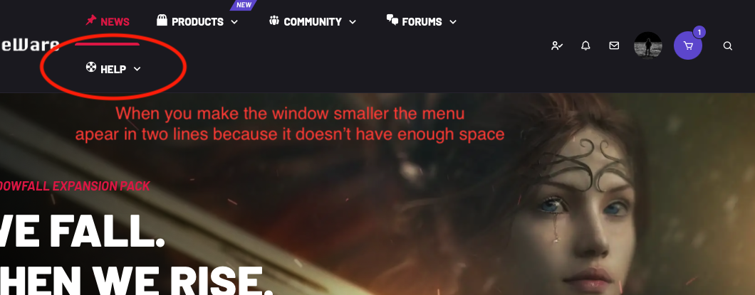
In the PC version, when you make the window smaller there is a moment when the menu does not have enough space and it is shown in 2 lines (as shown in the image).
Is there a way to make the tablet / phone menu display after a certain px measure to prevent this from happening?
It is a small detail, but if a user navigates in this window size, the menu is unprofessional in this way.
July 30, 2021 at 19:06 #33979
@themodactyl- 0 Topics
- 6788 Posts
Hi Bedurion,
Thanks for getting in touch! We’ve received your request and we’ll get you an answer shortly. 🙂
We really thank you for your patience!
In the meantime, feel free to check out our documentation resources for more help:
Kind regards,
August 2, 2021 at 10:49 #34009
@themosaurusrex- 0 Topics
- 2048 Posts
Hi Bedurion,
We’re still looking for the best/quickest solution to your issue.
We’re experiencing a much larger number of requests than usual so our wait times are longer than expected. We’re working hard to get back to you as quickly as we can and we really appreciate your patience!
Thank you for your patience.
August 4, 2021 at 17:54 #34073
@themosaurusrex- 0 Topics
- 2048 Posts
Hi Bedurion,
There are no easy way to solve this as it will vary from site to site. In consequence, we’ll keep on investigating this problem and find the right theme options to add in order to suit the most cases possible.
In the meantime, please try the following code snippet to your website to patch this issue:
/**
* Shrinking the menu for smaller desktop views.
*/
@media (min-width: 992px) and (max-width: 1050px) {
	.main-navigation:not(.vertical-navbar) .navbar-nav.navbar-nav--buddypress > .menu-item > a{
		max-width: 30px;
	}
}
@media (max-width: 1230px) and (min-width: 992px) {

	#navigation .nav.navbar-nav.navbar-nav--login {
	    margin-left: 1rem;
	}

	.main-navigation .navbar-nav.navbar-nav--main-menu > .menu-item > a {
		padding-left: .5rem;
		padding-right: .5rem;
		font-size: .85rem;
	}

	.navbar-brand {
		margin-right: .5rem;
	}

	.grimlock-site_identity .site-logo img {
		max-width: 90px !important;
	}

	.main-navigation .navbar-nav.navbar-nav--woocommerce {
	    margin-left: .5rem;
	}

	#navigation .nav.navbar-nav.navbar-nav--login {
	    margin-left: 1rem;
	}

	#navigation .nav.navbar-nav.navbar-nav--login li.menu-item a,
	#navigation .nav.navbar-nav.navbar-nav--login li.menu-item button {
		padding-left: 2.3rem;
		padding-right: 2.3rem;
		font-size: .85rem;
	}

	#navigation .nav.navbar-nav.navbar-nav--login li.menu-item:last-child a,
	#navigation .nav.navbar-nav.navbar-nav--login li.menu-item:last-child button {
    	padding-left: 3.3rem;
	}

	.main-navigation .navbar-nav--buddypress {
		margin-left: .45rem !important;
	}

}
@media (min-width: 1231px) and (max-width: 1300px) {
	.main-navigation .navbar-nav.navbar-nav--main-menu > .menu-item > a {
		padding-left: .5rem;
		padding-right: .5rem;
		font-size: .85rem;
	}
}
To add this code snippet to your site, we recommend that you paste it to the Custom CSS panel of your WordPress Customizer. Just go to your dashboard and navigate to “Appearance > Customize > Additional CSS”.
Pasting your code snippet there should do the trick for you.Also, it’s important to remember that we share snippet only to solve issues with our theme. Any further request for CSS snippets will have to be part of a defect that needs to be fixed urgently. No snippets will be shared otherwise.
If you want to go further with the customization of your website, we advise that you require customization work.
Thank you for understanding.
August 5, 2021 at 10:56 #34093
BedurionParticipant@bedurion- 23 Topics
- 53 Posts
Greetings, thanks for the code.
I have tried it and although it works, it still shows some visual error. I have decided to record a video that will better explain how the menu and logo are displayed at every moment.
https://photos.app.goo.gl/wb7Hpfjoxg4LgNXy6
Sometimes the logo size is not correct, and sometimes at the menu, the help section it’s displayed down.
August 19, 2021 at 05:24 #34473
@themodactyl- 0 Topics
- 6788 Posts
Hi Bedurion,
We’re sorry to read this snippet doesn’t solve this
It’s best if we take a quick look at this. Could you create a new website user for us please? If possible with administrator capabilities so we can make a quick check of your settings. You can post the user name and password in your next reply and mark it as private to keep this between us.
Please be aware that we do not have another choice to minimize the logo too as you have a lot of items in the navigation.
Thank you.
August 19, 2021 at 09:33 #34478
BedurionParticipant@bedurion- 23 Topics
- 53 Posts
Greetings! It worked perfectly! Thank you very much, it has been solved in a perfect way.
Apart from the above (which has now been resolved), and taking advantage of this topic, from the desktop I have seen that compressing the window to the tablet version, the logo is very small. But if I keep compressing it until the mobile version, it shows correctly larger thanks to the following code:
This happens regardless of the code we used before to solve the menu problem. I have not been able to check it on a tablet, but I have checked it from the computer.
Thanks!
August 22, 2021 at 21:53 #34535
@themodactyl- 0 Topics
- 6788 Posts
Hi Bedurion,
I’m glad to read we were able to help you.
I’m not sure to understand. Do you have another issue concerning the size of the logo or the topic you mentioned helped you solve this?
Best,
August 23, 2021 at 10:13 #34540
BedurionParticipant@bedurion- 23 Topics
- 53 Posts
I will attach a video to explain it better, in it you can see how there is a moment when the logo becomes smaller than normal when the window is reduced in desktop.
https://photos.app.goo.gl/yXdQVxt5wtQnQYeP6
Thank you.
August 25, 2021 at 00:43 #34595
@themodactyl- 0 Topics
- 6788 Posts
Hi Bedurion,
Thank you for your screencast. 🙂
You just have to change the max width in this snippet to increase the logo correctly. Please find the adjusted snippet below:
/**
* Increase the logo size on mobile
*/
@media (max-width: 991px){
     .main-navigation .navbar-brand__logo img {
          height: 50px !important;
          max-height: none !important;
          max-width: none !important;
     }
}
Best,
August 25, 2021 at 13:58 #34611
@themodactyl- 0 Topics
- 6788 Posts
I’m glad to read we were able to help you Bedurion. 🙂
If it’s not already done, feel free to review our theme on our Themeforest page: Armadon – Gaming Community WordPress Theme.
It’s very appreciated and it helps us making our products more known to new potential customers, which allow us more time to improve the quality over time and develop new features. It’s a win-win !
And by doing this, you will be making a great contribution to our community! #SharingIsCaring ❤️
Thank you!
August 26, 2021 at 12:12 #34631 -
AuthorPosts
The topic ‘Fix visual error when compressing window on pc.’ is closed to new replies.

