Find Answers and Get Support › Forums › Gwangi – PRO Multi-Purpose Membership, Social Network & BuddyPress Community Theme › Installation & Updates › Theme Installation and Updates › Grimlock for buddypress – Version 1.2.0
- This topic has 15 replies, 2 voices, and was last updated 6 years, 1 month ago by
 Jean-Pascal.
-
AuthorPosts
-
 CarstenParticipant@privatedanish
- 8 Topics
- 39 Posts
Hello again. 🙂
First, I had to restore a backup. To get back to the old setup/style!
1. Match me icon. Should not be shown, on the members own profile page!
Please removed it!2. Features members icon. I cannot see why a lightning icon is better that a flame icon and furthermore, it’s not replaced everywhere.
Please keep it as is was!3. See the number 18. Not centered! But is actually everywhere. Especially buttons.
Please fix it.5. An Issue with the nav header. It looks like the color is shining through. The color comes from the Global background color. See picture. Nav-1.
Please turn it off. 🙂These are some of the main styling issues, at least on my site. However, I have the same problems on my testing server.
All styling issues, are more or less related to the buddypress profile page – and I think the Grimlock for buddypress is the villain.I haven’t updated your plugins and theme!! Because, see pictures – I will let the pictures speak for themselves.
I hope you can fix these issues. If not, then I’ll not be able to update anymore!
1. Positive things regarding the update. The columns and rows styling, looks great. A table around the profiles fields, etc. Looks much better.
2. And after restoring, the poke me page is back.
3. And your right about the “BuddyPress Xprofile Custom Field Types plugin”. I have already contacted buddydev and they said, that they are gonna fix, asap.
Best regards Carsten.
February 18, 2020 at 13:51 #10103
@themopteryx- 0 Topics
- 615 Posts
Hi @privatedanish,
I have created a brand new topic to be able to deal with all your issues :).
Could you create a new website user on your test environnement (with all themes and plugins up to date) for us please (the old one doesn’t seem to be working)? If possible with administrator capabilities so we can make a quick check of your settings. You can post the user name and password in your next reply and mark it as private to keep this between us.
Cheers,
February 18, 2020 at 13:54 #10105
@themopteryx- 0 Topics
- 615 Posts
Hi @privatedanish,
To change these points, simply add the following code snippet to your website:
/* 1. Hide the match percentage for non logged users */
body:not(.logged-in) .profile-header--member .hmk-percentage {
	display: none !important;
}

/* 2. Change bolt icon to fire icon */
#buddypress:not(.youzer) div.item-list-tabs.primary-list-tabs > ul > li#members-featured > a:before,
#buddypress:not(.youzer) div.action .bp-featured-members-button a:before, #buddypress:not(.youzer) #members-list div.action .bp-featured-members-button a:before, #buddypress:not(.youzer) #groups-list div.action .bp-featured-members-button a:before, #buddypress:not(.youzer) #friend-list div.action .bp-featured-members-button a:before, #buddypress:not(.youzer) #mods-list div.action .bp-featured-members-button a:before, #buddypress:not(.youzer) #admins-list div.action .bp-featured-members-button a:before, #buddypress:not(.youzer) div#item-header #profile-header #item-buttons.action .bp-featured-members-button a:before {
    font-family: 'gwangi' !important;
	content: '\e92e';
}

/* 5. Remove shining header */
#header-cover-image {
	opacity: 1 !important;
}

/* Prevent overflow header  */
@media (min-width: 1200px) {
	#buddypress:not(.youzer) div#item-header #profile-header {
		height: auto;
	}
	.profile-header__avatar {
		top: 120px;
	}
}

/* Limit mycred badges size */
#mycred-users-badges img {
	max-width: 70px !important;
}

/* Remove field seperator on register */
#buddypress .standard-form .editfield {
	border: none;
	padding-top: .5rem;
	padding-bottom: .5rem;
}

/* Fix submit button on register page */
#buddypress .standard-form#signup_form div.submit {
    float: right;
    padding: 0;
    border: 0;
    margin: 1rem 0 0 0;
}
What do you mean by “3. See the number 18. Not centered! But is actually everywhere. Especially buttons. Please fix it.”
Forgive me, but I’m afraid I don’t understand this one.Regards,
February 19, 2020 at 11:36 #10141
CarstenParticipant@privatedanish- 8 Topics
- 39 Posts
Hi Jean-Pascal.
I really appreciate your commitment and I thank you for time and effort. 🙂
Most CSS codes worked very well.
/* 1. Hide the match percentage for non logged users */
body:not(.logged-in) .profile-header–member .hmk-percentage {
display: none !important;
}
—————————————————————————————————————
Didn’t work! I can remove it, by removing body. But then is gone everywhere. (Hide on users own profile, when they are logged in!)
—————————————————————————————————————
/* 2. Change bolt icon to fire icon */
#buddypress:not(.youzer) div.item-list-tabs.primary-list-tabs > ul > li#members-featured > a:before,
#buddypress:not(.youzer) div.action .bp-featured-members-button a:before, #buddypress:not(.youzer) #members-list div.action .bp-featured-members-button a:before, #buddypress:not(.youzer) #groups-list div.action .bp-featured-members-button a:before, #buddypress:not(.youzer) #friend-list div.action .bp-featured-members-button a:before, #buddypress:not(.youzer) #mods-list div.action .bp-featured-members-button a:before, #buddypress:not(.youzer) #admins-list div.action .bp-featured-members-button a:before, #buddypress:not(.youzer) div#item-header #profile-header #item-buttons.action .bp-featured-members-button a:before {
font-family: ‘gwangi’ !important;
content: ‘\e92e’;
}
—————————————————————————————
Worked like a dream!
—————————————————————————————
/* 5. Remove shining header */
#header-cover-image {
opacity: 1 !important;
}
—————————————————————————————
Worked like a dream!
—————————————————————————————
/* Prevent overflow header */
@media (min-width: 1200px) {
#buddypress:not(.youzer) div#item-header #profile-header {
height: auto;
}
.profile-header__avatar {
top: 120px;
}
}
—————————————————————————————————————
/* Prevent overflow header */
@media (min-width: 1200px) {
#buddypress:not(.youzer) div#item-header #profile-header {
height: auto;
}
#buddypress:not(.youzer) div#item-header .profile-header__avatar {
top: 75px;
}
}
—————————————————————————————
As you can see I changed the CSS a bit.
But the – @media (min-width: 1200px) – have no effect.
—————————————————————————————
/* Limit mycred badges size */
#mycred-users-badges img {
max-width: 128px !important;
}
—————————————————————————————
Worked like a dream!
—————————————————————————————
/* Remove field seperator on register */
#buddypress .standard-form .editfield {
border: none;
padding-top: .1rem;
padding-bottom: .1rem;
}
—————————————————————————————
Gap still to big, even if I set the padding from 5 to 1rem.
—————————————————————————————
/* Fix submit button on register page */
#buddypress .standard-form#signup_form div.submit {
float: right;
padding: 0;
border: 0;
margin: 1rem 0 0 0;
}
—————————————————————————————
Worked like a dream!
—————————————————————————————You are welcome to login. Regarding the hmk-percentage/.hmk-match-inside, etc…
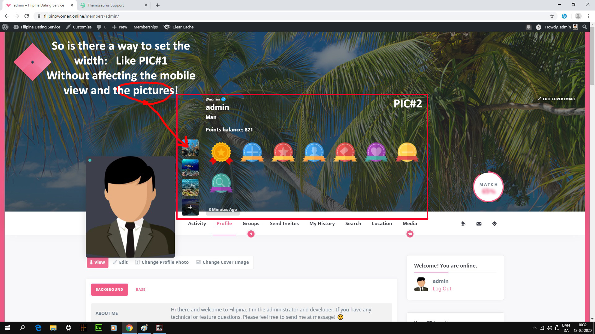
Is it possible to move the macth me icon up a bit, lets say – height: 150px !important;
See the picture, regarding number 18.Best regards Carsten. 🙂
February 19, 2020 at 17:46 #10154
@themopteryx- 0 Topics
- 615 Posts
Hi @privatedanish,
To change this, simply add the following code snippet to your website:
/* Remove submit button margin top */
#hero .bps_form .submit {
   margin-top: 0 !important;
}

/* Center media bubble number */
#buddypress:not(.youzer) #profile-content__nav ul li > a span {
   letter-spacing: 0 !important;
}
Can you summarize the problem with matchmaking on the profile? I’m afraid I don’t understand.
Regards,
February 21, 2020 at 09:52 #10191
CarstenParticipant@privatedanish- 8 Topics
- 39 Posts
Hi Jean-Pascal.
First I want to thank you(all) for your help and support.
And that I have learned a lot about, how to use the google/CSS selector and this has giving me a greater understanding, how CSS more or less works. Thanks… 🙂1.The Match me Icon:
Viewing your own Profile – Icon Display: none!
Viewing others members Profile – Icon Display: True!Members can only view each others profile, if they are logged in.
Of course, there should be a Match me icon, on your own profile. There is no reason, to match yourself. 🙂
———————————————————————————————————
/* Hide the match percentage for non logged users */
body:not(.logged-in) .profile-header–member .hmk-percentage {
display: none !important;
}
———————————————————————————————————
I changed (.logged-in) to (.logged_in).
But now no one can see the Match me Icon!NOTE: It worked before and still does on my main site. Because I haven’t updated you theme + plugins.
2. Regarding the sign up form. I like the old one much better. So can I please get it back. See picture…
Best regards Carsten. 🙂
February 21, 2020 at 15:35 #10198
@themopteryx- 0 Topics
- 615 Posts
Hi @privatedanish,
It’s nice to hear that!
1. To achieve this, simply add the following code snippet to your website:
body.my-profile .profile-header--member .hmk-percentage {
   display: none  !important;
}
2. These are changes appeared following a standardisation of the general UI due to several plugin updates and also feedback from all our buyers.
Since you’re concerned about the details, you’ve seen the difference, but for us it’s not a major change which may require a code snippet.Cheers,
February 24, 2020 at 10:43 #10216
CarstenParticipant@privatedanish- 8 Topics
- 39 Posts
Hi Jean-Pascal.
I understand that, of course. However, it also depends on, which theme you have installed and yes, that’s the first thing I check, after an update.
If the styling/theme design has changed…etc.I prefer it clean, monotonous and that the design/style fits together, throughout the site. 🙂
The match me snippet didn’t work.
——————————————————————
body.my-profile .profile-header–member .hmk-percentage {
display: none !important;
}
——————————————————————
We have been working on the wrong item. It’s not “.hmk-percentage”.
It’s “.hmk-percentage.fake”
——————————————————————
/* Hide the match percentage on your own profile */
#buddypress:not(.youzer) div#item-header .hmk-percentage.fake {
display: none !important;
}
——————————————————————–
This snippet works like a dream. 🙂Regarding the updates. There is simply so many style changes in your latest updates, which I don’t prefer.
I have tried to create a child theme twice. But every time, I end up with the classic demo. Blue and no picture..etc.Is it possible to create a child theme? That actually looks like my main site. So we can avoid this problem in the future?
1.I still haven’t updated. Because of the signup form, etc.
2. I still have a issue with signup form and the profile header. See picture – before and after!
3. And number 18 didn’t move at all!
If you can fix all these issues with a snippet. Then let’s try that!
But I would prefer a child theme.Best regards Carsten. 🙂
February 25, 2020 at 17:49 #10280
@themopteryx- 0 Topics
- 615 Posts
Hi @privatedanish,
Creating a child theme will not prevent you from having design changes as the theme is updated, since the parent theme handles all the visual components. Unless you keep a copy of the parent theme and take the parts you prefer and paste them into the child theme. It’s up to you :).
In the Themeforest package you should have a default child theme from which you can start again. If you have any concerns about this, feel free to create a
1. What are the problems with the registration form?
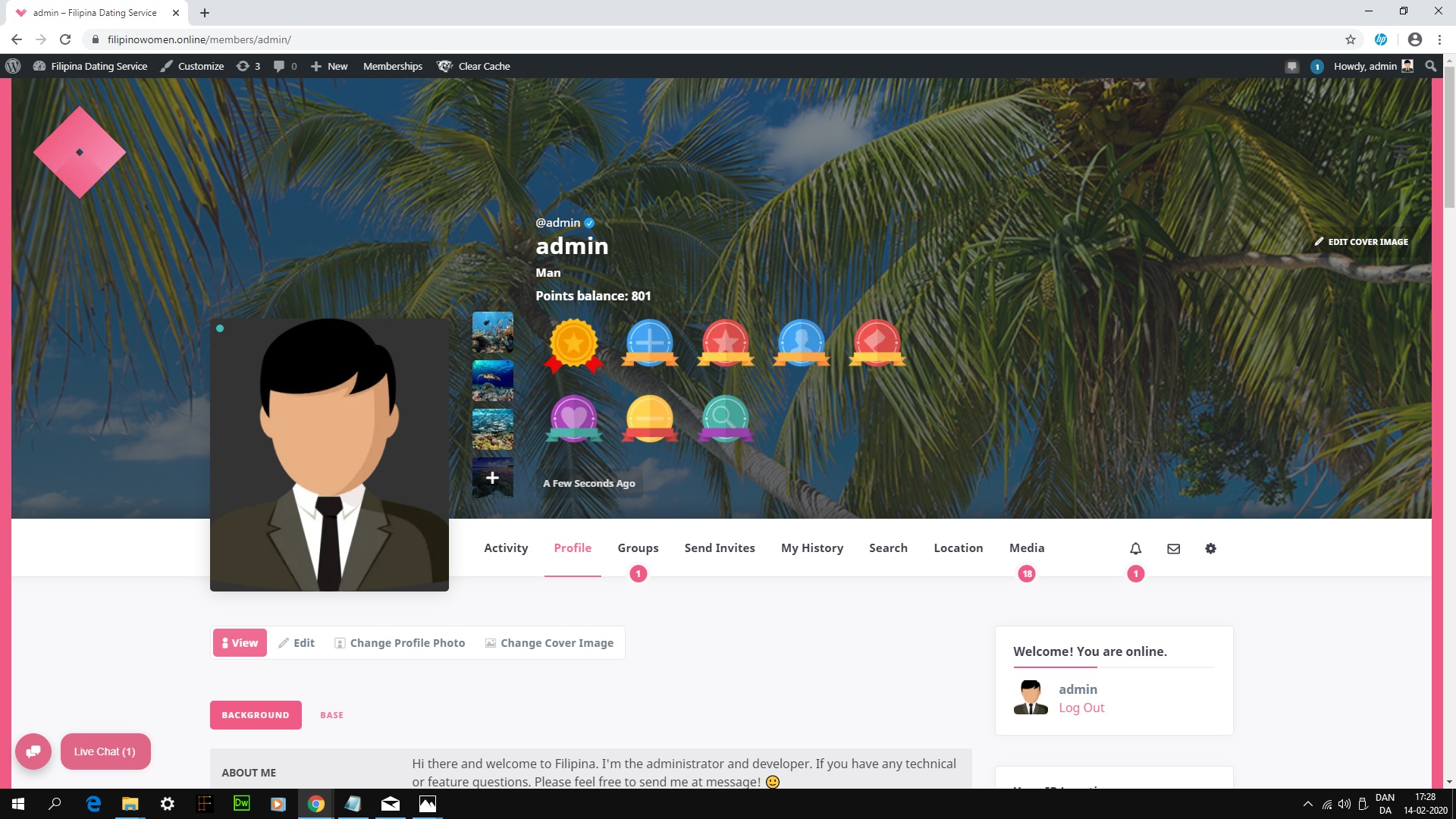
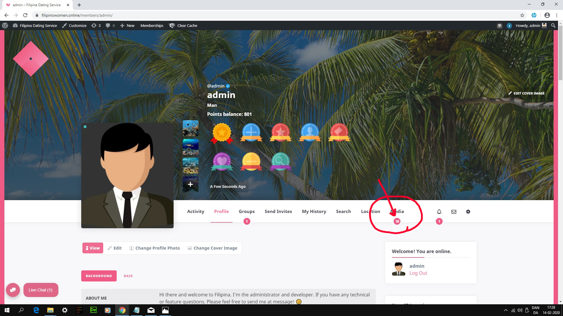
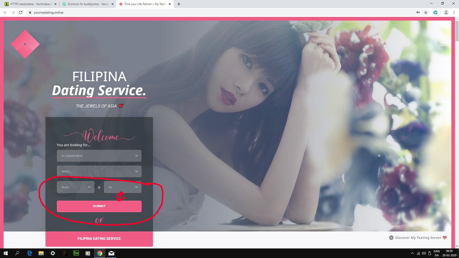
2. I don’t see overlap issue on the member profile header : https://youmedating.online/members/admin/
3. I don’t see any problem with these numbered circles. For very small items (such as these), it may also depend on the screen or text aliasing. This can give an impression of “mis-alignment”. Using the snippet I gave you above should reduce this effect, but there is nothing more we can do.
Regards,
February 27, 2020 at 15:40 #10300
CarstenParticipant@privatedanish- 8 Topics
- 39 Posts
Hi Jean-Pascal.
Sorry for the delay. I have successfully updated all your plugins and fixed most styling issues myself.
And I have decided not to install a child theme, after several failed attempts. 🙂I have removed the rtmedia plugin, which causes many viewing issues. Especially on the mobile view.
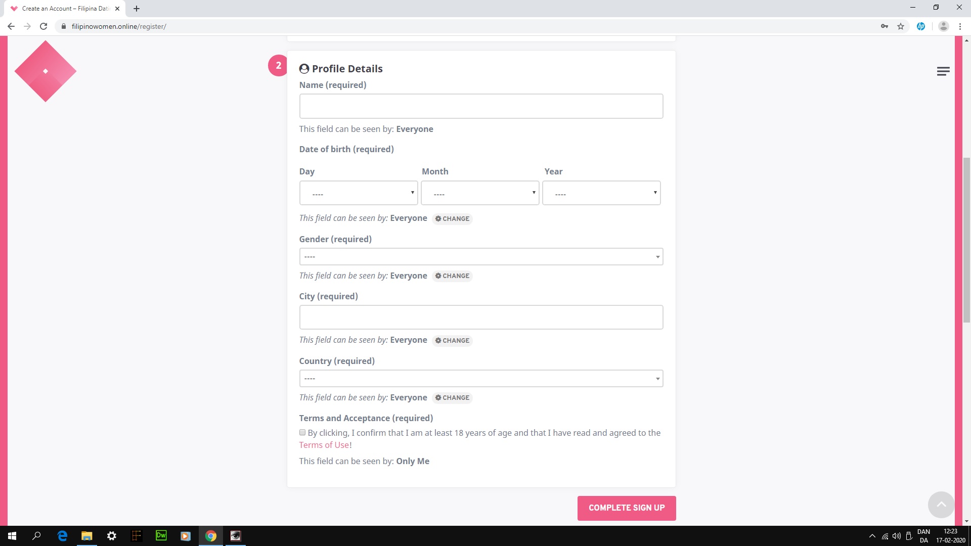
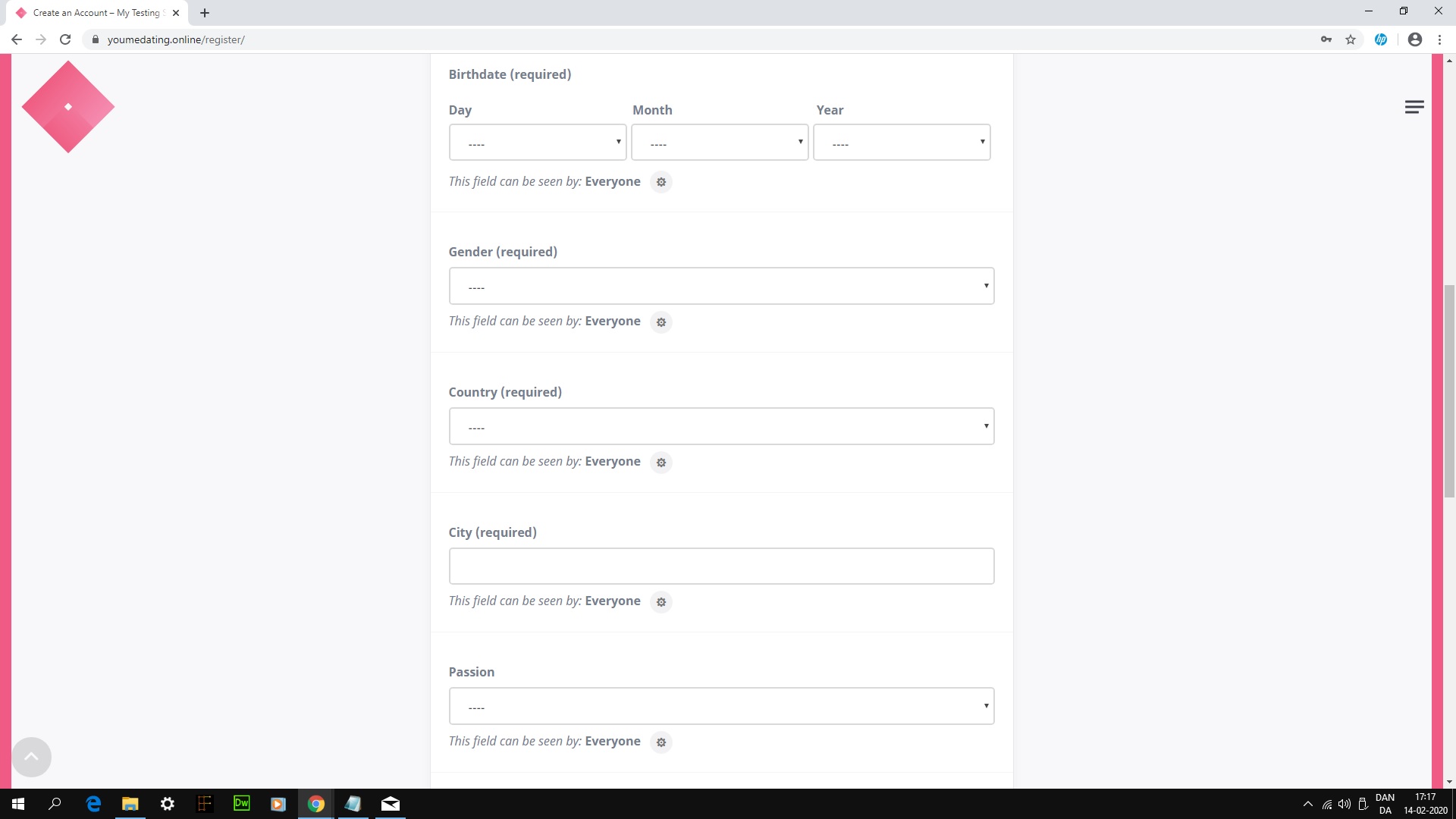
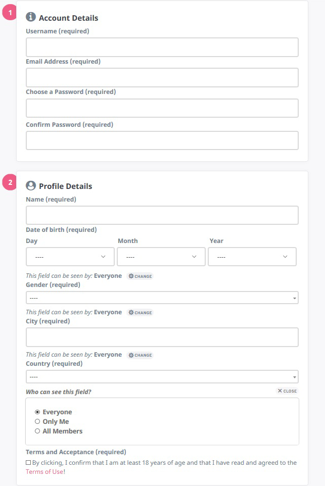
And installed Mediapress instead. Which works much better, with your theme. Nice viewing on the mobile and with a few style changes, it looks acceptable.Regarding the register form. If is possible to change a few item. See already posted picture!
1. Icon before profile details and account details!
2. x Close button underneath!
3. Setting icon and choose! after everyone text.Activity page.
1. Star icon – favorites in the upper right corner, as before and no dropdown menu, thanks.
2. Delete/text – button as it where before. Beside comment!Icons on profile picture:
1. Please allow at least 5 icons to be shown, before the dropdown menu is shown, thanks.That’s all for today! Best regards Carsten. 🙂
March 6, 2020 at 15:50 #10467
@themopteryx- 0 Topics
- 615 Posts
Hi @privatedanish,
As I said before, these are changes appeared following a standardisation of the general UI due to several plugin updates and also feedback from all our buyers. Since these changes mainly involve minor interface changes (such as favorite action or show/close settings buttons for example), we will not provide snippets to change them as they cannot be considered as a bug.
Since you are preoccupied with details, here is a snippet that we provide you with as a courtesy:
/**
* Add icons to register title sections
*/
.register-section#basic-details-section .entry-title:before {
	content: '\f14b';
	font-family: 'fontAwesome';
	margin-right: .25rem;
	font-size: 1em;
}
.register-section#profile-details-section .entry-title:before {
	content: '\f2bd';
	font-family: 'fontAwesome';
	margin-right: .25rem;
	font-size: 1em;
}

/**
* Add text to visibility/toggle buttons
*/
#buddypress .standard-form button.visibility-toggle-link,
#buddypress .standard-form button.field-visibility-settings-close {
	font-size: 0.8rem;
	width: auto;
	padding: 5px 10px;
	letter-spacing: 0;
	border-radius: 500px;
}
#buddypress .standard-form button.visibility-toggle-link:before,
#buddypress .standard-form button.field-visibility-settings-close:before {
	margin-right: 5px;
}
Please note that we have not been able to reproduce the scrollbar problem on mobile.
Can you tell us which browser you are on and if this problem also appears on a mobile browser?Regards,
March 11, 2020 at 17:21 #10591
CarstenParticipant@privatedanish- 8 Topics
- 39 Posts
Hi Jean-Pascal.
I understand and thanks. 🙂
The register page looks okay now. I minimized it, by removing unnecessary text and space..etc. See picture:
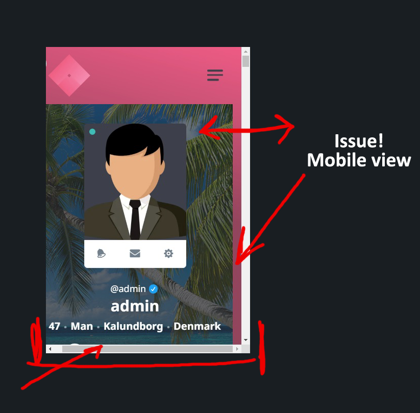
Mobile/ipad issue:
1. This issue is only on the profile page and shows on ipad and mobile view.
2. I use google and edge. No issue on live mobile view (my phone or Iphone). A far as I can see.
When I edit CSS in the selector on wordpress. It shows different on my mobile view. Than is does on wordpress mobile view.
So I can’t really use that option to edit!
3. Same issue on my testing server.
2. I have deactivated all plugins. Except buddypress. But the issues is still there.
3. When I deactivate all plugins, the gap gets bigger!
4. When I use the boxed layout in the global settings, it disappears!
5. When I install another theme, it disappears.
6. So it seems to be related to the theme.Wishlist:
1. The Buddypress Nouveau templates? I can’t set it, in buddypress settings! Why?
2. I still have an Issue with the logo size on wordpress login!
3. Icons on the profile picture. I want it show at least 5 icons. Before the drop down menu shows! Thanks.Best regards Carsten. 🙂
March 17, 2020 at 14:18 #10695
@themopteryx- 0 Topics
- 615 Posts
Hi @privatedanish,
I’m afraid I don’t understand your concern about mobile editing.
Are you talking about editing CSS in mobile preview in the WordPress customizer?Could you provide us with screenshots of this please? Please don’t hesitate to comment or highlight your screenshots to help us better understand your issue.
For any feature that is not yet implemented in our theme or in our plugins, feel free to create features request in the appropriate section of our forum.
We will implement these new features if other community members upvote them!Best regards,
March 20, 2020 at 17:29 #10795 -
AuthorPosts


Hi there,
This topic has been inactive for a while now so we will be closing it to keep the forum tidy. Don't hesitate to create a new topic if you still need help and we'll be glad to help you!
Best regards,
The Themosaurus team.
The topic ‘Grimlock for buddypress – Version 1.2.0’ is closed to new replies.