Find Answers and Get Support › Forums › Gwangi – PRO Multi-Purpose Membership, Social Network & BuddyPress Community Theme › Feature Requests › Hero layout, new-layout-options—hero-boxed-left-or-right!
- This topic has 20 replies, 3 voices, and was last updated 6 years, 1 month ago by
 Jean-Pascal.
-
AuthorPosts
-
 @themopteryx
- 0 Topics
- 615 Posts
Hi @privatedanish,
To change this, simply add the following code snippet to your website:
#hero.region--12-cols-center-boxed .region__container {
   margin-left: 0;
}
To add this code snippet to your site, we recommend that you paste it to the Custom CSS panel of your WordPress Customizer. Just go to your dashboard and navigate to “Appearance > Customize > Additional CSS”.
Pasting your code snippet there should do the trick for you.Also, it’s important to remember that we share snippet only to solve issues with our theme or sometimes as a courtesy. No snippets will be shared otherwise.
Regards,
October 25, 2019 at 09:40 #8230
CarstenParticipant@privatedanish- 8 Topics
- 39 Posts
H support.
Thanks a lot, for sharing the css. It worked just great and you can actually use the spread options, to adjust the box.
I also have a little issue with my logo, on the mobile/Ipad. This will probably also require some css. 🙂 It looks fine on the desktop, but on the Ipad/mobile, it is very small – tiny! I have tried many possibilities. But nothing seems to work and the navbar icon, is bigger than the logo, not good.
I hope you can help. The logo size is 250×85. But I really want to be able, to adjust it myself.Maybe you should consider, integrating a header builder into your team. That includes menus and logos, etc!
Best regards Carsten.
November 5, 2019 at 12:38 #8374
@themopteryx- 0 Topics
- 615 Posts
Hi @privatedanish,
Could you please provide us a link of your website so we can make a quick check?
Please don’t hesitate to comment or highlight to help us better understand your issue.Best regards,
November 6, 2019 at 11:07 #8389
@themopteryx- 0 Topics
- 615 Posts
Hi @privatedanish,
To change this, simply add the following code snippet to your website:
@media (max-width: 992px)
.main-navigation .navbar-brand__logo img {
    max-height: 75px !important; /* Adjust the height to your needs */
}
Regards,
November 7, 2019 at 09:15 #8400
CarstenParticipant@privatedanish- 8 Topics
- 39 Posts
Hi support.
There were a few LBRACE Error’s in the css.
@media (max-width: 992px)
.main-navigation .navbar-brand__logo img {
max-height: 75px !important; /* Adjust the height to your needs */
}
————————————————————————-
So I fixed it and now It works perfectly.@media (max-width: 992px) {
.main-navigation .navbar-brand__logo img {
max-height: 65px !important; /* Adjust the height to your needs */
}
}
————————————————————————-One more issue with the mobile/Ipad. “Customizing ▸ Appearance ▸ Navigation” – Mobile Background Color, Background Color, Background Color on Scroll is set to None color. But it still shows the Global background color. Is it possible to fix this?
Best regards Carsten.
November 12, 2019 at 17:11 #8430
@themoceratops- 1 Topics
- 433 Posts
Hi @privatedanish,
Glad you were able to make the snippet work 🙂
The reason why you see the global color on mobile for navigation is because we intentionally did not put the navigation inside the header on mobile. We did that for compatibility to avoid some issues on mobile in some cases. That is also why we created the “Mobile Background Color” field. My advice would be to set a Mobile Background Color to make it look better on mobile, instead of having the global color.
Hope this helps.
Best regards,
November 12, 2019 at 17:34 #8431
CarstenParticipant@privatedanish- 8 Topics
- 39 Posts
Hi Support.
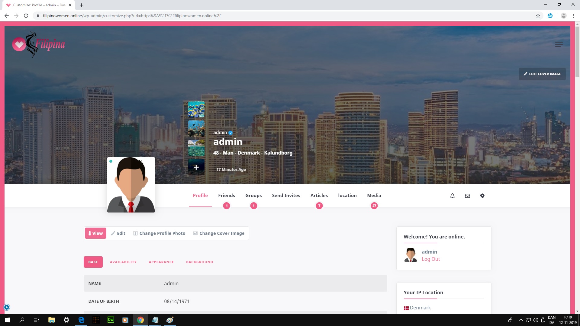
Thanks for the info. But I’m sorry to say, that the Mobile Background Color doesn’t work on the top, nav or header on the mobile, but only in the nav menu. The only way you can change that color, is in the global background color settings? and that would affect all devices! So if you can show the background picture on the desktop, way not on the mobile/Ipad? But I think is depends on which template you are using. The Homepage template: minimal & Minimal template, have this issue.
Grimlock login plugin still have an issue. See the picture..
Best regards Carsten.
Note: After updating Yoast SEO plugin yesterday. I couldn’t get access to any Buddypress profile! So now it’s deactivated! “Please share, with others. So the know which plugin, there is causing the issue”
If anybody wants/needs a “Return to profile” link. Here is the recipe!
<div align="center"><a href="https://(your domain)/members/me/"><br>Return to profile</a></div>November 27, 2019 at 15:45 #8594
@themoceratops- 1 Topics
- 433 Posts
Hi @privatedanish,
Could you please provide us with screenshots of the nav issue? Please don’t hesitate to comment or highlight your screenshots to help us better understand your issue.
For the login issue, can you please update the Grimlock Login plugin to the latest version ? This should fix the issue.
Also, thank you for sharing the info about Yoast SEO 🙂
Best regards,
November 28, 2019 at 10:07 #8598
CarstenParticipant@privatedanish- 8 Topics
- 39 Posts
Hi Support.
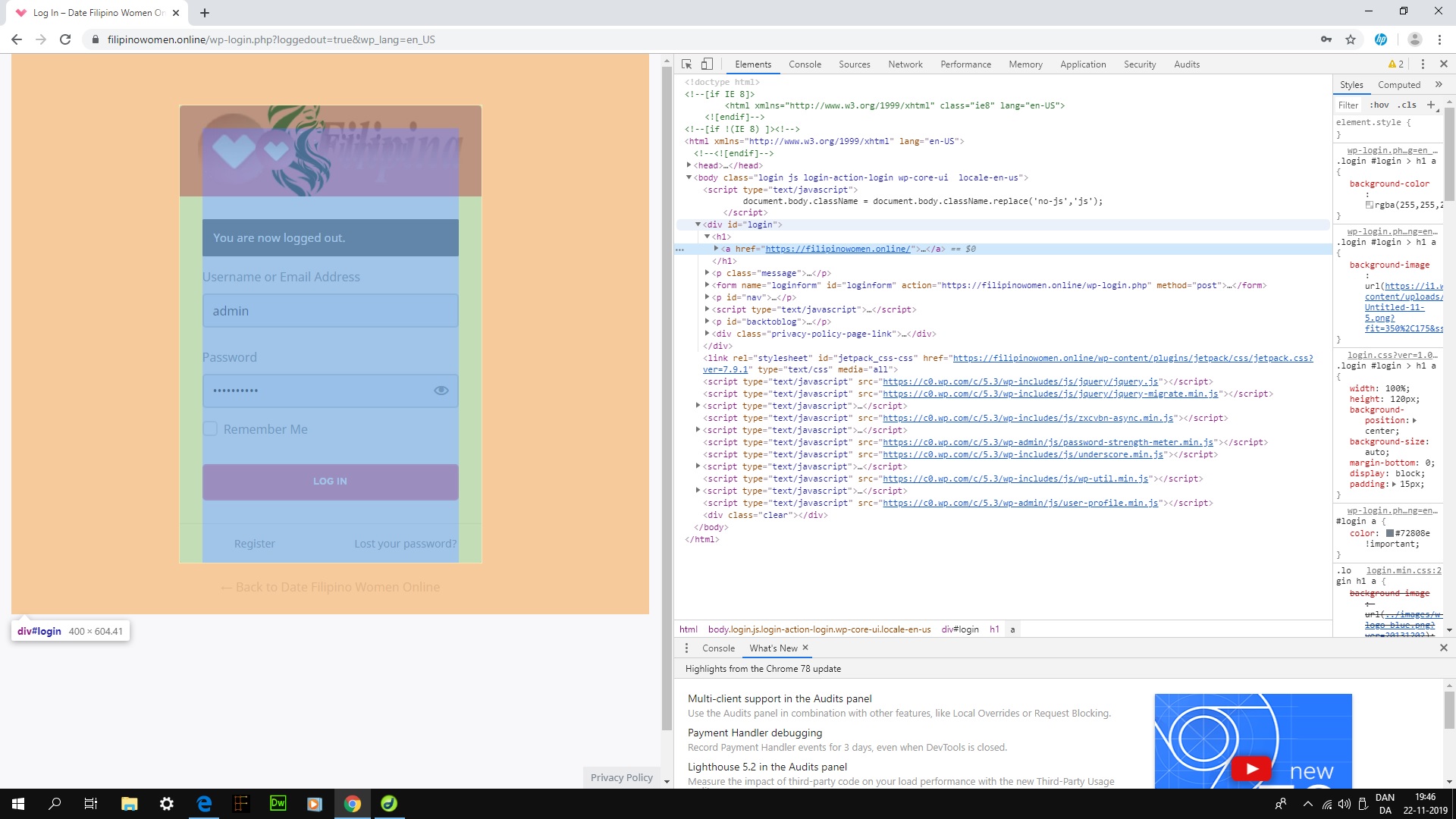
Your welcome. But I already have the most recent Grimlock Login Version 1.0.7 installed. Here is a new picture of the issue. Every time you update the plugin, the big logo picture, moves further to the left and down a bit 🙂 How can I remove this picture?
Regarding the nav issue. I will return as soon as possible. 🙂
Best regards Carsten.
November 28, 2019 at 19:06 #8603
@themoceratops- 1 Topics
- 433 Posts
Hi @privatedanish,
I just did a quick check of your website and I see that this is indeed an issue in our Grimlock Login plugin, which we definitely will fix in the next update. Thank you for your feedback!
I’ll be waiting for your reply about the nav issue.
Regards,
November 29, 2019 at 14:18 #8610
@themoceratops- 1 Topics
- 433 Posts
Hi @privatedanish,
We just released a new update for Grimlock Login (1.0.8) which should fix the issue. Can you please update the plugin and tell us if it works for you?
Regards,
December 2, 2019 at 11:38 #8644
CarstenParticipant@privatedanish- 8 Topics
- 39 Posts
Hi Jason.
After updating the Grimlock Login, a few Issues occurred!
1. A Privacy Policy link is now shown, when you logout!
2. When you login, the Lost Password and Register link is shown twice! How can I remove these Issues/links?Best regards Carsten.
December 18, 2019 at 10:45 #8935
@themopteryx- 0 Topics
- 615 Posts
Hi @privatedanish,
We just released a new update for Grimlock Login (1.0.10) which should fix the “privacy policy” link position.
Can you please update the plugin and tell us if it works for you?For the duplicated buttons, this is an issue in our Theme Gwangi, which we definitely will fix in the next update.
In the meantime, simply add the following code snippet to your website:
.login-footer + .login-footer { display: none !important; }Thank you for your feedback!
Regards,
December 18, 2019 at 11:05 #8941
@themopteryx- 0 Topics
- 615 Posts
Hi @privatedanish,
We recently release a new version of Gwangi. Updating your theme and all the required plugins to the latest version should definitely fix this issue.
Regards
December 20, 2019 at 15:53 #8999
@themopteryx- 0 Topics
- 615 Posts
Hi @privatedanish,
Unfortunately, I have no idea why the background color is like that.
But you can still add the following code snippet to your website:
@media screen and (max-width: 992px) {
	.buddypress.bp-user #navigation,
	.buddypress.single-item.groups {
		position: absolute !important;
		top: 0 !important;
		left: 0 !important;
		width: 100% !important;
		z-index: 10 !important;
	}
	#item-header {
		padding-top: 90px !important;
	}
}
That should do the trick.
Regards,
March 20, 2020 at 17:22 #10794
@themopteryx- 0 Topics
- 615 Posts
March 23, 2020 at 09:09 #10837 -
AuthorPosts


The topic ‘Hero layout, new-layout-options—hero-boxed-left-or-right!’ is closed to new replies.

