Find Answers and Get Support › Forums › Gorgo – Multi-Purpose Gutenberg Blog & Magazine Theme › Website Setup › Widgets › Image Categories resolution
- This topic has 9 replies, 3 voices, and was last updated 5 years, 11 months ago by
 Manathan.
-
AuthorPosts
-
 MadalinParticipant@electricspeed
- 10 Topics
- 34 Posts
Hi there,
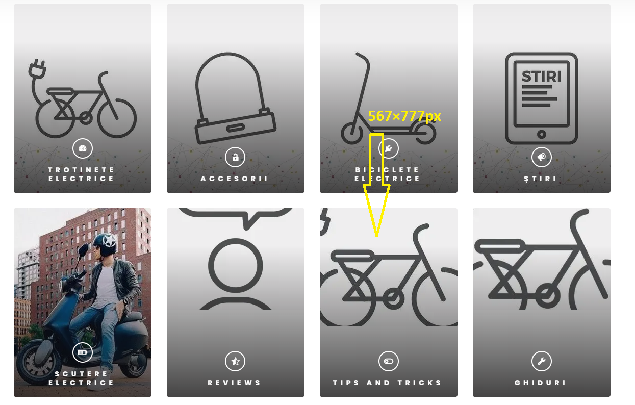
I’m trying to achieve the same result as in your demo, but after many tries I could not make it work. I do not know what size for images to use in the categories widget to have a decent look on all devices. If I choose 270x370px resolution it looks good on desktop but looks blurry on mobile and tablet. If I add a higher resolution image 1078x1501px it shows only the center of image, and not the whole image. I have attached an image to see what I’m trying to say.
Thank you,
MadalinOctober 21, 2019 at 18:09 #8150
@themopteryx- 0 Topics
- 615 Posts
Hi @electricspeed,
We force the image resizing/centering so that most images fit the items area.
To change this, simply add the following code snippet to your website:.grimlock-term-query-section__terms .card .card-media img { min-width: 0; min-height: 0; object-fit: none; }Thereafter, you can use a higher ratio for the images (273×377 by default) such as 567×777 for example.
Note that all images must now have the same size, because there are no more “forced resize”.Regards,
October 22, 2019 at 09:32 #8168
MadalinParticipant@electricspeed- 10 Topics
- 34 Posts
Hello Jean-Pascal,
I have inserted the code you have provided me, and still doesn’t look good, please see attachment.
You can check it live on: https://electricspeed.ro/
Thank you,
MadalinOctober 22, 2019 at 11:40 #8177
@themopteryx- 0 Topics
- 615 Posts
Hi @electricspeed,
Could you please create a new website user for us? If possible with administrator capabilities so we can make a quick check of your settings.
You can post the user name and password in your next reply and mark it as private to keep this between us.Cheers,
October 22, 2019 at 21:51 #8194
@themopteryx- 0 Topics
- 615 Posts
This reply has been marked as private.October 23, 2019 at 10:22 #8202
@themopteryx- 0 Topics
- 615 Posts
Hi @electricspeed,
Thank you for your precious feedback.
There is definitely an issue in our theme which will be fixed in the next update.At the moment the images are cropped in 500×370 and fit the item area with the help of CSS.
While waiting for the update, I advise you to put a real picture (not an icon) and remove the CSS snippet I gave you above.Thank you for your patience.
Best,
October 23, 2019 at 13:40 #8204
MadalinParticipant@electricspeed- 10 Topics
- 34 Posts
Ok, thank you for your support. The current pictures is not an icon, it’s an image containing an icon. The problem is that on other devices (phone and tablet) it looks blurry, only on desktop it looks good with 270x370px resolution.
I will wait for the update.
Regards,
MadalinOctober 23, 2019 at 13:47 #8205
@themodactyl- 0 Topics
- 6788 Posts
Hi @electricspeed,
We recently release a new version of your theme. Updating your theme, Grimlock plugins and all the other recommended plugins to the latest version should fix this issue.
If you have correctly updated the theme and Grimlock, the problem should now be fixed. You might still be seeing the issue because your browser cache is showing you an older version of the page (browsers do that to load pages faster). So to see that the issue is resolved you will need to empty your browser cache and reload the page. If you want to read more on what browser cache is and how to clear it, here is an article that might help you:
https://www.lifewire.com/how-to-clear-cache-2617980Cheers,
June 6, 2020 at 13:37 #13710 -
AuthorPosts

The topic ‘Image Categories resolution’ is closed to new replies.

