Find Answers and Get Support › Forums › Cera – Intranet & Community Theme › Website Setup › Menus › Navigation responsive issues
- This topic has 11 replies, 4 voices, and was last updated 5 years, 8 months ago by
 Jean-Pascal.
-
AuthorPosts
-
 Pilgrim Creative TeamParticipant@pilgrimteam
- 19 Topics
- 55 Posts
Hello!
I have some issues with the menu and its responsiveness. There are some weird breakpoints where the menu is really awful. No issues on standard screensizes but a lot of complications when the user resizes the window for instance. The main issue is between 991px and 1234px.
Before going through the css and redefining a million media queries, I was wondering if you had a quick fix or good suggestion to enhance this behavior.I’m attaching the screenshots of the different results I get at different breakpoints.
Thanks!
June 18, 2020 at 12:52 #14082
@themodactyl- 0 Topics
- 6788 Posts
Hi @pilgrimteam,
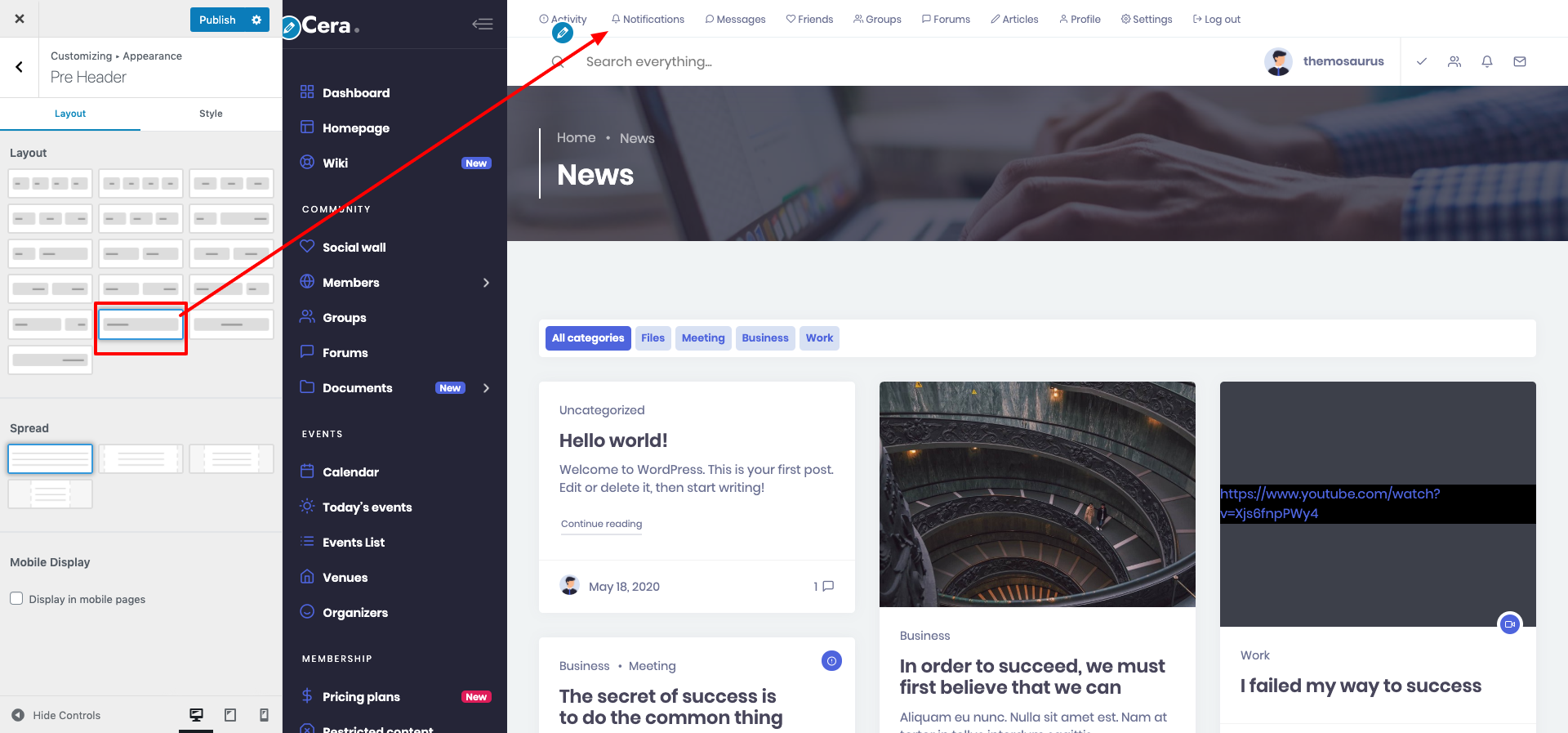
Unfortunately, your navigation is too wide. I suggest you delete some items of the main navigation and put them in the pre-header, in a new menu.
If this is not enough, you can also reduce your logo and play on the padding. This will help you.
Best,
June 19, 2020 at 09:05 #14105
@themodactyl- 0 Topics
- 6788 Posts
Hi @pilgrimteam
Have you tried any of the advice above?
If you want, we can make you a snippet to hide the username and keeping only the avatar, reduce the logo and change some padding. These changes will be applied only on tablet.
What do you think ? I look forward to your return.
Best,
June 23, 2020 at 15:01 #14196
Pilgrim Creative TeamParticipant@pilgrimteam- 19 Topics
- 55 Posts
Hi @themodactyl! Unfortunately, none of these solutions fixed my issues.
Firstly because I need all the pages in the menu, and also because (and that might be me just not looking hard enough) I don’t find how to add a secondary menu in the pre-header. That would be great if I could do that, though, because some things are less essential than others. I tried doing that through the customizer using the Grimlock navigation component but it’s not what I expected (it’s floating top – left, very big, covering my nav…)Regarding the snippet, i’d be glad to have it & I think it could also help other people. Thanks for offering 🙂
Have a great weekend,
June 26, 2020 at 19:18 #14301
@themosaurusrex- 0 Topics
- 2048 Posts
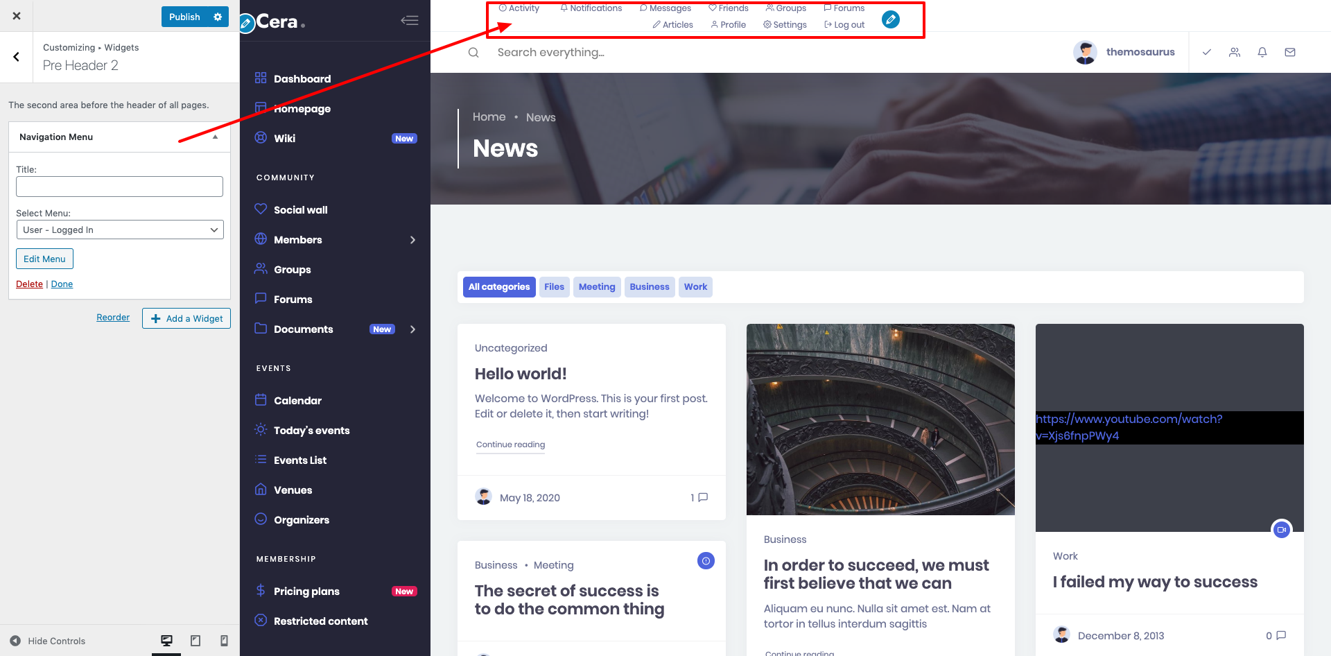
@pilgrimteam You can add an extra menu to your preheader using the Navigation Menu widget. It’s more suited to this region than the Grimlock Navigation Menu. The widget can contain any existing menu or one just created for this purpose. Once you’ve selected you menu, simply adjust the preheader layout to what’s best for your website. (Please see attached.)
June 29, 2020 at 11:05 #14328
Pilgrim Creative TeamParticipant@pilgrimteam- 19 Topics
- 55 Posts
Hi, thanks again for all the effort put in the support!
I have a weird format issue, which I realize is linked to the sticky nav.
When sticky nav is activated, following @themosaurusrex ‘s advice doesn’t work (see screenshot 1)
But it’s displaying as it should when “sticky nav” is unchecked (see screenshot 2) — though I need the sticky nav, duh ??♀️Probably fixable with some CSS but I notice the header design has a tendency to break when switching to other options (see screenshot 3 when I disable the secondary menu and just change my nav from top to left side??)
Might be some configuration error/override on my side? I don’t detect it through the inspector.
But there definitely seems to be an issue with the sticky nav ?At the moment it’s not urgent for me so I’m sticking (no pun intended) to the simple, 1 menu, breakable sticky nav, as long as we don’t add more elements to the menu it should be fine for now!
But maybe it’s a case to crack for later…
Cheers!
 Screenshot-2020-06-29-à-16.29.20-scaled
Screenshot-2020-06-29-à-16.19.44-scaled
Screenshot-2020-06-29-à-16.16.44-scaled
June 29, 2020 at 16:32 #14365
@themosaurusrex
Screenshot-2020-06-29-à-16.29.20-scaled
Screenshot-2020-06-29-à-16.19.44-scaled
Screenshot-2020-06-29-à-16.16.44-scaled
June 29, 2020 at 16:32 #14365
@themosaurusrex- 0 Topics
- 2048 Posts
@pilgrimteam OK, this is definitely an issue that needs to be fixed. I’ll leave this topic open for further investigation on our side.
Anyway, I’m glad to read that you’ve been able to solve this by… Sticking… To the primary menu. ?
You can rest assured that we’ve registered this issue and that we’ll try to fix this ASAP.
June 30, 2020 at 11:01 #14405
@themopteryx- 0 Topics
- 615 Posts
Hi @pilgrimteam,
We recently released a new version of your theme.
Updating your theme, Grimlock plugins and all the other recommended plugins to the latest version should fix the pre-header issue.Dont’t hesitate to get back to us if you see some display issues with the navigation.
Than you very much (again) for your valuable feedback!
Cheers,
July 2, 2020 at 11:41 #14513
Pilgrim Creative TeamParticipant@pilgrimteam- 19 Topics
- 55 Posts
Hey @themopteryx,
You’re right, I hadn’t updated my theme…
However I tried again now that everything is up to date and it still doesn’t display properly when the main nav is set to sticky (see screenshot).
Any idea what’s causing this?Thanks a lot,
July 8, 2020 at 12:56 #14937
@themopteryx- 0 Topics
- 615 Posts
Hi @pilgrimteam !
Thank you for reaching out to us!
It’s best if we take a quick look at this…
Could you create a new website user for us please? If possible with administrator capabilities so we can make a quick check of your settings.
You can post the user name and password in your next reply and mark it as private to keep this between us.Thank you.
July 8, 2020 at 17:56 #14945
Pilgrim Creative TeamParticipant@pilgrimteam- 19 Topics
- 55 Posts
This reply has been marked as private.July 8, 2020 at 23:34 #14964
@themopteryx- 0 Topics
- 615 Posts
Hi @pilgrimteam,
Thank you for reaching out to us!
The preheader area seems to be fine on your site (cf. screenshot). Maybe there was a cacheing issue?
Can you confirm that the preheader displays correctly after clearing your browser’s cache?At the moment, I removed the widget from this area and I leave it up to you to add it again and adjust its display :).
Please note that we are open to discussion about the display of this area!
Cheers,
July 9, 2020 at 08:18 #14972 -
AuthorPosts


Hi there,
This topic has been inactive for a while now so we will be closing it to keep the forum tidy. Don't hesitate to create a new topic if you still need help and we'll be glad to help you!
Best regards,
The Themosaurus team.
The topic ‘Navigation responsive issues’ is closed to new replies.


