Find Answers and Get Support › Forums › Gwangi – PRO Multi-Purpose Membership, Social Network & BuddyPress Community Theme › Popular Features › Activity Stream › Size of images on mobile is too small
- This topic has 17 replies, 2 voices, and was last updated 4 years, 2 months ago by
 Manathan.
-
AuthorPosts
-
 René WappiezParticipant@wappiez
- 106 Topics
- 352 Posts
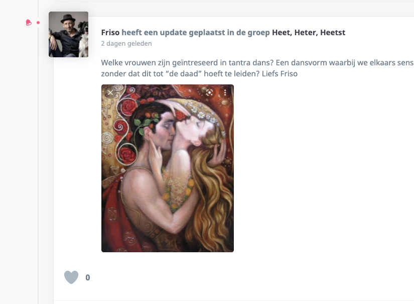
Hi,
Before the last theme update the images on mobile would align 1 by 1 underneath each other. Now they are being put next to each other. I prefer them to be below each other because then everything becomes clearer and people would not have to load a picture to see it more clear. Is this possible?
Thx
January 28, 2022 at 12:54 #38394
@themodactyl- 0 Topics
- 6788 Posts
Hi René, 🙂
To change this, simply add the following code snippet to your website:
/**
* Put Pictures in One Column on Mobile
*/
@media (max-width: 576px) {
	#buddypress .activity .rtmedia-list {
		display: grid;
		grid-template-columns: 1fr;
	}
	#site #buddypress:not(.youzer) #activity-stream.grimlock-buddypress-activity-list .activity-item .activity-inner .rtmedia-list-item{
		min-width:100%;
		width:100%;
		display:block;
		padding-right:0px !important;
	}
}
To add this code snippet to your site, we recommend that you paste it to the Custom CSS panel of your WordPress Customizer. Just go to your dashboard and navigate to “Appearance > Customize > Additional CSS”.
Pasting your code snippet there should do the trick for you.Also, it’s important to remember that we share snippet only to solve issues with our theme. Any further request for CSS snippets will have to be part of a defect that needs to be fixed urgently. No snippets will be shared otherwise.
If you want to go further with the customization of your website, we advise that you require customization work.
Regards,
January 31, 2022 at 13:08 #38429
René WappiezParticipant@wappiez- 106 Topics
- 352 Posts
Thx
February 1, 2022 at 11:36 #38468
René WappiezParticipant@wappiez- 106 Topics
- 352 Posts
The size of images on desktop is also too small btw. Can this be made larger?
February 1, 2022 at 12:49 #38473
René WappiezParticipant@wappiez- 106 Topics
- 352 Posts
Using the current code creates a problem on mobile, see attached. These images are now put beneath each other. Is it possible for this part to be put horizontal?
February 2, 2022 at 12:52 #38502
René WappiezParticipant@wappiez- 106 Topics
- 352 Posts
No worries, thx.
February 3, 2022 at 10:48 #38529
René WappiezParticipant@wappiez- 106 Topics
- 352 Posts
Is it possible to make the size of a single image on desktop larger as well? This was larger before, now they have become very tiny.
February 7, 2022 at 10:23 #38582
René WappiezParticipant@wappiez- 106 Topics
- 352 Posts
No, see attached. Normal uploaded images are really small on the activity page.
February 9, 2022 at 09:41 #38692
@themodactyl- 0 Topics
- 6788 Posts
Hi René,
To make the image bigger, simply add the following code snippet to your website:
/**
* Make the Images in Activity Stream Bigger
*/
@media (min-width: 768px){
	#buddypress .activity-content .rtmedia-list .rtmedia-list-item.media-type-photo{
		width: 50% !important;
		min-width: 50% !important;
	}
}
You can let 50% as value or change to 100% to take the full width.
To add this code snippet to your site, we recommend that you paste it to the Custom CSS panel of your WordPress Customizer. Just go to your dashboard and navigate to “Appearance > Customize > Additional CSS”.
Pasting your code snippet there should do the trick for you.Also, it’s important to remember that we share snippet only to solve issues with our theme. Any further request for CSS snippets will have to be part of a defect that needs to be fixed urgently. No snippets will be shared otherwise.
If you want to go further with the customization of your website, we advise that you require customization work.
Regards,
February 11, 2022 at 10:08 #38736
René WappiezParticipant@wappiez- 106 Topics
- 352 Posts
Thx. I’ve now tried 50% and 100%, but both don’t seem to be working. It’s still very tiny on desktop. Maybe desktop should be specified in the code?
February 14, 2022 at 08:41 #38794
@themodactyl- 0 Topics
- 6788 Posts
Hi René,
Strange, this snippet works fine on our side. Perhaps a plugin interfere. Could you create a new website user for us please? If possible with administrator capabilities so we can investigate and edit this snippet to make it works on your website.
You can post the user name and password in your next reply and mark it as private to keep this between us.Please note that this snippet only works for screens larger than 769px. Beyond this screen size, the screen is considered a desktop screen.
Thank you.
February 14, 2022 at 10:24 #38804
René WappiezParticipant@wappiez- 106 Topics
- 352 Posts
This reply has been marked as private.February 16, 2022 at 15:24 #38852
René WappiezParticipant@wappiez- 106 Topics
- 352 Posts
Perfect, it worked. Thx
February 18, 2022 at 11:28 #38891 -
AuthorPosts


The topic ‘Size of images on mobile is too small’ is closed to new replies.

