Support only during business hours : Monday to friday, from 8:30 am – 5:30 pm CEST
Be sure we're doing our best to manage your topic as soon as possible.
After increasing logo size for mobile and tablet, my desktop appearance changed logo and menu changed location as seen in the screen shot below. the view on desktop has scattered but ok on tablet and mobile. check at fitnesssolutions.i.ng
Pls help me with how to resolve them
Yes I have used the code below as your instructed but didn’t work for me.
/**
* Increase the logo size on mobile
*/
@media (max-width: 768px){
.main-navigation .navbar-brand__logo img {
height: 50px !important;
max-height: none !important;
max-width: none !important;
}
}
Hello, I optimized images and removed unused css on my website ebizdemy.com and it has affected the structure of my site. theme images are no longer showing and some functions too. Please i need help on how to resolve these issues
You're trying to setup your theme but you're experiencing errors when importing the demo content? Or you've just followed the setup guide but your website doesn't look exactly like our demo? These are common issues for which you can find easy and quick fixes.
Feel free to review our theme on Themeforest! It helps us making our products more known to new potential customers, which allow us more time to improve the quality and develop new features. #SharingIsCaring ❤️
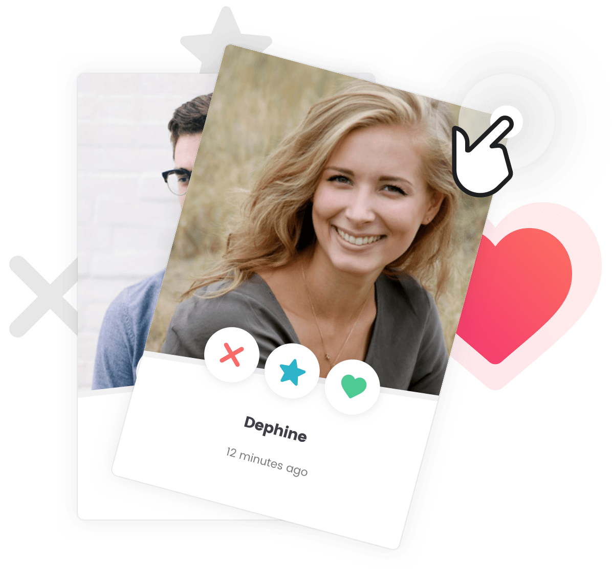
Add powerful matching features like Member likes, skips, super likes, conditional private messaging and much more.
To unleash the full power of your Cera or Gwangi theme, we have partnered with the Zipline team. Your community website can now be fully setup and turned into your very own custom app for iOS and Android.
Whether you've newly acquired the theme or already got your site up and running, Zipline got you covered. And we got you an incredible discount.