niftythreeNifty
Forum Replies Created
-
AuthorPosts
-
NiftyParticipant@niftythree
- 31 Topics
- 142 Posts
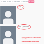
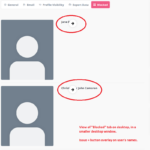
Hi Manathan,
Sure, we have attached some screenshots. 🙂
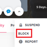
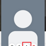
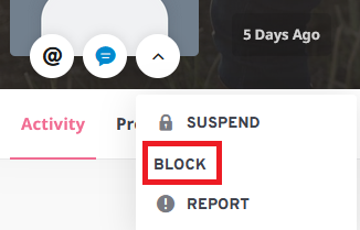
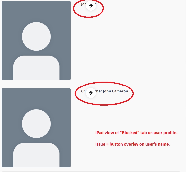
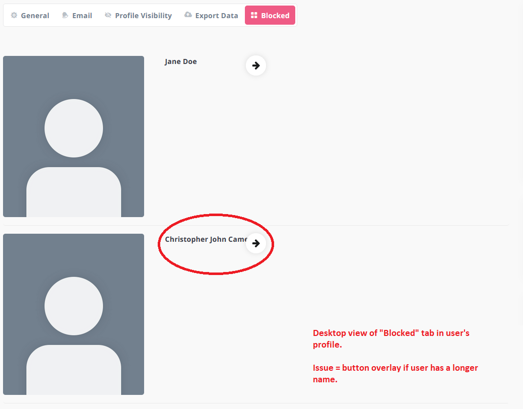
They include desktop view, tablet view and mobile view. As you will note, the Block/Unblock button is shown as an arrow (which also doesn’t change when someone is blocked) which isn’t very clear as to what it does. It would be good to have better icons for the Block/Unblock button. When the screen is small enough to trigger the more actions dropdown, the Block/Unblock text option doesn’t have an icon next to it, like everything else.
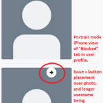
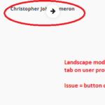
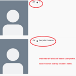
If a user has a longer name, the button will overlay over their name. On a mobile phone, their names are placed under their photo, which looks inconsistent compared to someone with a shorter name in the list, and the unblock button is placed over the user’s photo.
Thanks.
 User-Card-Block-Unblock-Button-Profile-No-Icon-2
 User-Card-Block-Unblock-Button-Profile-2
 iPhone-Portrait-2
 iPhone-Landscape-2
 iPad-Portrait-2
 iPad-Landscape-2
 Desktop-Smaller-2
 Desktop-2
October 14, 2021 at 11:16 #35909
NiftyParticipant@niftythree
Desktop-2
October 14, 2021 at 11:16 #35909
NiftyParticipant@niftythree- 31 Topics
- 142 Posts
Hi Manathan,
We don’t believe that it’s a BuddyPress issue, as the issue doesn’t occur when a default theme is used (we’ve tested on Twenty Seventeen, Twenty Nineteen and Twenty Twenty-One).
We tested the snippet from the link you included, but it doesn’t fix the issue. Instead, it changes the warning message displayed to the user, and causes it to be displayed on both desktop and mobile. This warning message is displayed regardless of the photo size the user attempts to upload.
Can we please have a fix for this?
Thanks.
October 11, 2021 at 14:54 #35767
NiftyParticipant@niftythree- 31 Topics
- 142 Posts
Hi Manathan,
You’re correct; after looking into it more, we think the issue only occurs on the most recent version of Grimlock for BuddyPress. When we rolled back our site to the previous version of Grimlock for BuddyPress and removed or edited the snippet, the issue wasn’t occurring. 🙂
Thanks.
September 29, 2021 at 14:20 #35490
NiftyParticipant@niftythree- 31 Topics
- 142 Posts
Hi Manathan,
Thanks for creating the new topic.
Regarding the original issue we posted about in this thread (filter text being truncated), we think we’ve worked out what the issue was.
It seems to be related to a CSS snippet we’d added previously from here: https://support.themosaurus.com/forums/topic/filtering-in-member-swap-isnt-viewable-on-mobile-devices/
When this snippet is removed, or code is added to make the snippet apply to specific pages only, the issue of truncated filter text is resolved.Thanks.
September 29, 2021 at 12:18 #35484
NiftyParticipant@niftythree- 31 Topics
- 142 Posts
Hi Manathan,
We have just tried posting a new topic regarding the new issue above, but after submitting the topic the page just refreshes and doesn’t post anything. We have also tried posting in another forum area and without any attachments, but the problem persists.
Thanks.
September 29, 2021 at 10:23 #35471
NiftyParticipant@niftythree- 31 Topics
- 142 Posts
Hi Manathan,
We’ve tried posting the below as new topic, but there seems to be issues with the forum currently, and we can’t create any new posts. Therefore, we’re posting it here.
————————————————————————————————
Issue with “display primary menu as accordion on mobile” in new Grimlock update
————————————————————————————————Hello,
We like the new “display primary menu as accordion on mobile” feature included in the recent Grimlock update, but there’s a slight issue with it; secondary sub-items aren’t indented underneath their primary sub-item, meaning that all menu items are together as a single list under their main heading. This makes it confusing for the user.
We’ve attached a few screenshots to help explain the issue;
1. How the issue presents from the front end in mobile view (and have indicated an example of which secondary sub-items from the menu should be indented).
2. How the menu looks from the backend, and how the sub-items should be indented.
3. How the same menu looks in desktop view from the front end.The line spacing between menu items also appears to be inconsistent, as seen in the first image, which appears to be related to secondary sub-list items.
Thanks.
September 28, 2021 at 14:24 #35454 -
AuthorPosts


